

In today’s mobile-first world, creating a WordPress site that looks and works flawlessly across every device isn’t just a nice-to-have—it’s an absolute necessity. Over 60% of global web traffic now comes from mobile devices, and Google primarily uses the mobile version of your site for ranking . Yet, achieving true responsiveness in WordPress remains one of the most persistent challenges for developers and site owners alike.
Why Responsive Design in WordPress Is Surprisingly Complex
The difficulty stems from a simple reality: WordPress isn’t a single, monolithic system. It’s a dynamic ecosystem where themes, plugins, and custom code must work together harmoniously. Each layer—from the theme’s foundation to individual blocks and third-party scripts—can introduce responsiveness issues .
Here’s where things get tricky:
- Theme quality varies widely: Not all “responsive” themes are created equal. Some rely on outdated techniques or contain bloated code that slows mobile loading times .
- Gutenberg block limitations: The built-in editor lacks granular responsive controls for many blocks, making it challenging to fine-tune appearance on different devices without custom coding .
- Plugin conflicts: Plugins that work perfectly on desktop can interfere with mobile layouts, causing elements to overflow, overlap, or break entirely .
- Image optimization: Even with WordPress’s built-in
srcsetfunctionality, images can still bottleneck performance if not properly compressed and sized .
Start with the Right Foundation
The path to responsiveness begins before you write a single line of code. Choosing a genuinely mobile-friendly theme—not just one labeled as such—saves countless hours of troubleshooting. Lightweight themes like Astra, GeneratePress, and WordPress’s own Twenty Twenty-Five default themes consistently deliver strong mobile performance with clean, minimal code . Test any theme’s demo on your own phone before committing.
Using Visual Builder plugin
Choosing between Elementor and Spectra isn’t just about which has better responsive controls—it’s about which philosophy fits your workflow. One gives you a separate design universe with endless possibilities; the other supercharges the native block editor while keeping things lightweight. But neither should make you underestimate what the default block editor can already do.
It’s easy to think you need a page builder for anything responsive, but the default WordPress block editor is more capable than you might think.
Optimize Images for Mobile Performance
Images represent the largest portion of page weight, making them prime optimization targets. WordPress automatically generates multiple image sizes and applies srcset attributes to serve appropriately sized versions based on the user’s screen . However, you still need to:
- Compress images using plugins like TinyPNG, WebP Express, or Imagify to reduce file sizes without sacrificing quality
- Convert to WebP format for dramatically smaller file sizes (25-35% reduction from JPEG/PNG)
- Enable lazy loading so images load only when they’re about to appear in the viewport
Consider Responsive Blocks Plugins
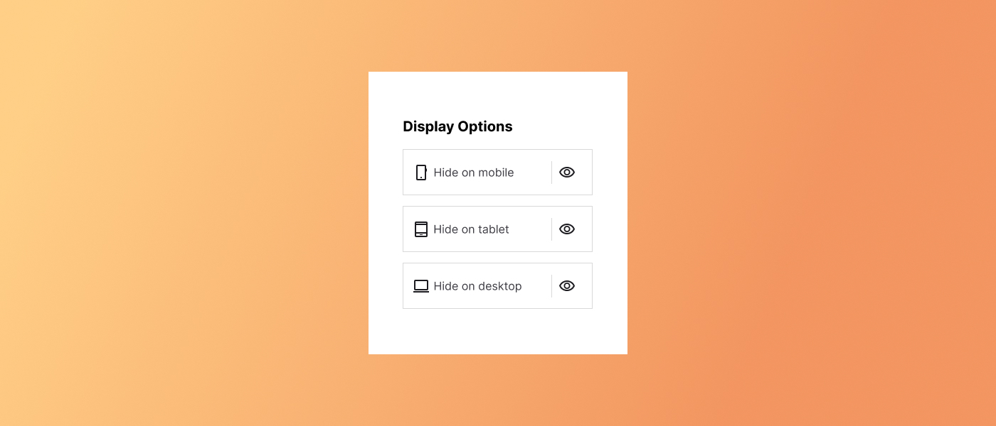
For users who prefer not to write code, plugins can bridge the responsiveness gap. Block Responsive integrates directly with the Gutenberg editor, adding device-specific controls to core blocks so you can hide, show, or style elements differently on mobile, tablet, and desktop .
Mindspun Responsive Blocks takes a similar approach, offering fully responsive versions of common blocks with separate settings for each device . These tools are particularly valuable when you need granular control without modifying theme files.
Performance: The Crucial Second Layer
Responsive design isn’t just about layout—it’s about speed. Mobile users often browse on slower connections, making performance optimization inseparable from responsiveness :
- Enable caching with plugins like WP Rocket or LiteSpeed Cache to deliver static versions of pages faster
- Minify CSS and JavaScript using Autoptimize to reduce file sizes by 20-50%
- Use a CDN like Cloudflare to serve content from servers closer to your visitors
- Reduce server response time by choosing quality hosting and optimizing databases
Testing Your Responsive Site
Even the best implementations can have hidden issues. Testing across multiple devices and screen sizes is non-negotiable :
- Chrome DevTools: Use the device toolbar to simulate different screen sizes
- Google’s Mobile-Friendly Test: Quick check for major issues
- Lighthouse: Core Web Vitals assessment with mobile-specific metrics
- Real device testing: Nothing beats testing on actual phones and tablets, including mid-range Android devices (not just premium models)
Understanding the FSE / Block Editor Responsiveness Landscape
The key insight about FSE themes is that they are deliberately responsive by design. The underlying block-based architecture handles basic responsiveness automatically—content shifts, images scale, and columns stack as screen sizes decrease. However, this built-in responsiveness creates a tension: where classic themes gave you granular control over how elements appear at different breakpoints, FSE intentionally simplifies the process by assuming the layout will adapt on its own.
This works well for straightforward content. The problem arises when you need device-specific customization—larger heading fonts on mobile, reduced padding between stacked elements, or hiding certain content on smaller screens. The block editor, by default, provides limited tools for these nuanced responsive adjustments.
The Power of Global Styles and theme.json
The theme.json file is the backbone of any FSE theme. It defines your site’s design foundation—colors, typography, spacing, and layout constraints—that apply globally across all blocks.
Key settings in theme.json that impact responsiveness include:
- contentSize and wideSize : Define maximum content widths (e.g., 740px for standard content, 1140px for wide alignment)
- Spacing presets: Using viewport-relative units like min(2.5rem, 5vw) creates spacing that scales naturally across devices
- Typography defaults: Setting appropriate font sizes and line heights that work on mobile (minimum 16px body text)
The Neve FSE theme demonstrates this approach well—its spacing scale uses min() functions that combine fixed and viewport-relative units, ensuring consistent vertical rhythm while adapting to screen size.
Customizing Within the Site Editor
Access the Site Editor via Appearance → Editor in your WordPress dashboard. Here’s what you can control:
Global Styles (the half-filled circle icon) let you set site-wide defaults for:
- Colors (background, foreground, accent, and alternate palettes)
- Typography (fonts, sizes, weights, line heights for each heading level)
- Layout (content width, wide width)
- Per-block default styles (buttons, site title, site logo, quote blocks)
Making WordPress responsive isn’t inherently difficult—but it does require a systematic approach that addresses the full stack from theme selection through performance optimization to ongoing testing. The complexity comes from the interplay between various components: your theme’s foundation. And if you can handle custom CSS techniques like Grid and Flexbox, image optimization, caching, and careful plugin selection it opens whole new oppertunities.
By starting with a quality responsive theme, understanding modern CSS layout methods, optimizing media, and thoroughly testing across devices, you can create a WordPress site that delivers exceptional experiences regardless of how visitors access it. Mobile traffic isn’t just growing—it’s already dominant. Investing in comprehensive responsiveness ensures you’re not leaving that audience behind
Leave a Reply